
If you buy something through our links, ToolGuyd might earn an affiliate commission.
I have been spending a lot of time adjusting small parts of the ToolGuyd website layout, and have also turned my attention to the comments section.
Minor Changes
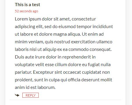
Commentor names used to be followed by “says,” such as “Stuart says,” with the comment text following. This seemed unnecessary and was removed.
For mobile devices, I added a “reply” arrow next to the reply button. It’s redundant, but this makes for a better indentation that simply whitespace. If this doesn’t provide enough accidental tap/click protection, I can try to find a different solution. The arrow itself is not clickable or tappable.
I have also changed the time. This was an interesting challenge, and I believe I got everything right.
Basically, instead of “Feb 21, 2021 at 7:54pm, comment timestamps now say “5 minutes ago,” or similar. This seems more useful. If needed I can create a “tooltip” where hovering gives you the posting day, but most readers are on mobile devices with no mouse-hover function.
Also, if more than one year has passed, older comments receive a calendar date stamp, e.g. Feb 10, 2020. I can change this, but the 1-year mark seems like a suitable threshold.
Potential Changes
Comment Ordering
Right now, comments are ordered oldest to newest. So when you scroll down a page, or hit the “comments” link at the top of a post page or on the home page, you arrive at the oldest comment.
There is a switch I can flip that reverses the order so that you see the newest comments first.
Do you want to see the newest comments first?
This doesn’t affect “nested” comments where you might have multiple replies. And so, if you reply to the oldest comment, your reply will be at the bottom of the page under the oldest comment, despite being the newest comment.
If I do this, I might move the comment box to the top of the section. But for something like a giveaway post, I can always create an on-page link to take you straight to the comment text box.
Thoughts?
Comment Loading
Some posts get a lot of comments, and that can involve a lot of scrolling.
I very briefly experimented with a “lazy loading” plugin that can load comments via infinite scrolling or by clicking a button. It broke the scroll bar on the desktop view, and that didn’t give me a good feeling about it.
In my opinion, this might be useful for posts with very many comments, but it could be more useful for when comments are displayed from newer to older rather than older to newer. This way if there are only a couple of new comments, you don’t have to scroll very much or click any buttons to read them.
I will try to pursue a tidier solution.
Comment System
Not happy with how the “lazy loading” comment plugin worked, I started looking into alternatives and found another comment system plugin that provides similar functionality and also a lot more.
One thing I like about this 3rd party plugin is that comments are still left on the site, as opposed to being a 3rd party system, and so I can always turn it off.
But there’s bad news. The plugin carries an enormous amount of bloat. In experimenting with it, I found myself disabling maybe 90% of its functionality.
It offered some good things, such as the ability to reorganize comments by age, interactions (number of replies) or “hottness” (reader votes). But, it also replaces some built-in functionality such as comment subscriptions with a less robust and possibly less reliable alternative.
There are a lot of appealing aspects to this plugin, but there are security concerns, update concerns, and loading time concerns. For instance, the plugin allows commentors to delete all of their past comments. You still cannot edit your comments, but you can delete all of them with two clicks?? Doing this must require some kind of back-door into the website database, and that’s bad. If someone does delete a comment that is replied-to, it breaks the commenting hierarchy for the entire post.
I have only had to block a few people from commenting over the years, but giving them the ability to delete everything and negatively and irreversibly affect others’ comments isn’t good.
Let’s say a comment has 10 replies, but is then deleted. Those 10 replies are also essentially deleted. It used to be that they would be pushed to the end of a post, but now they disappear from the page entirely. That would be very bad.
The plugin is also limited in a lot of regards because there are maybe 2 dozen paid modules designed to enhance the functionality.
I’ll look at once more, but this appears to be a dead end.
Comment Pages?
Comment “pages” might be a way to go, where you might not see any pages until say 25 or 40 comments on a page. 10 is way too few, 100 might be too many.
The built-in way of doing things is to load a duplicate page but with that next page of comments. There are ways to change with additional code to load each page with a button click or simply scrolling.
This is something I’ll start testing off-site.
One idea comes to mind, and that’s to change comment loading for older posts.
But, keep in mind that each comment is effectively a separate post. So if you have 50 comments, each of those take as many server resources to call for, retrieve, and load as a blog post, or at least a post without images.
It might not seem important, but loading speed, time, and number of elements on a page are very important to Google’s search engine and news feed. On one hand, Google likes user interactions. On the other, Google doesn’t want those interactions to hamper page speeds for users, especially mobile users.
So the question here is about how to improve how comments load with minimal disruption to the discussion. For example, one of the plugins I tested did improve comment loading speed, and the user experience wasn’t directly impacted, but it broke the vertical scroll bar, causing it to disappear. That’s still bad.
My goal is to optimize things in a way where you don’t even realize anything has changed.
Most magazines and consumer product websites, at least those that still have any comments section, place comments behind a link that then takes time to process things and load. That’s not user-friendly to me, and I assume you feel the same way. I’ll try to find something in the middle, or build the functionality myself.
Timetable
Aside from a couple of small to-do items, any major changes will likely take quite some time to learn, code, and implement.
I haven’t forgotten about the comment system features some of you have asked for, and I’m still looking for suitable solutions.
I’m mentioning all this because it really helps to have feedback.
If there’s something you like, don’t like, or want to request about the comment system, please let me know.
See Also: