
If you buy something through our links, ToolGuyd might earn an affiliate commission.
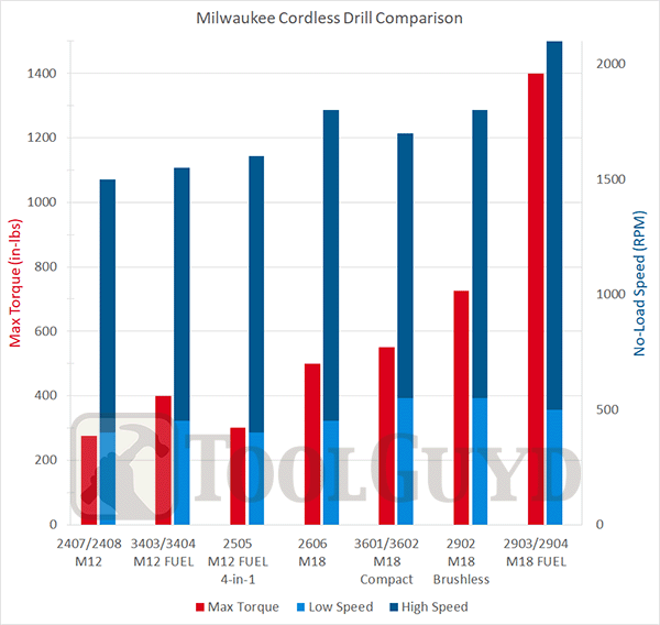
In another post, I created a bar graph that allows for quick visual comparison of Milwaukee cordless drill specs, with respect to maximum torque and no-load speed.
The two types of important technical specifications are not directly related, but it can be helpful to see how the values compare for different models in tandem.
For example, let’s say one drill delivers higher maximum torque but has a considerably lower top speed than another model. Seeing the torque and speed specs together can help convey and compare performance potential more clearly than simply looking at a bunch of numbers in a list.
If we’re going to include more of these bar graphs in other posts, it made sense to have a separate primer as to how to interpret them.
Bar graphs are usually fairly easy to understand, but two-axes bar graphs can be tricky. Hopefully this helps ensure everyone is on the same page. I’ll link to this post when using double axes graphs in the future.
| Apples | Oranges | |
|---|---|---|
| John’s Farm | 20 | 45 |
| Jane’s Farm | 15 | 35 |
| Amy’s Farm | 30 | 15 |
| Adam’s Farm | 25 | 50 |
For example purposes, let’s say there are 4 farmers, with each one growing apples and oranges. The two types of fruit are not directly related, but it can be helpful to see the data visualized together.

In the bar graph shown here, we have the number of applies on the primary y-axis to the left, and the number of oranges on the secondary y-axis to the right.
In this chart, the two y-axes are identical. The second axis here, to the right, is redundant.

In this chart, the scale corresponding to the number of apples has been adjusted to the count of apples.
We still have the number of apples to the left and number of oranges to the right.

Both of these charts show the same data, only in a different manner, depending on what’s important.
The chart with a common reference scale makes it easier to compare apples and oranges together, and the chart with two separate scales is for comparing apples to apples and oranges to oranges.
The axes will rarely be scaled similarly, and the units can also change.

In this example, we have the number of pizzas served and the number of olives used for 4 different pizzerias.
This chart has the numbers different on the primary (left) and secondary (right) axes. Couldn’t the data be shown with just one axes used as the reference scale?

Yes, and this is what it would look like. Which chart provides clearer or more helpful information with respect to pizzas served?

We could use two bar graphs instead. Combining them isn’t necessary, but can make it easier to see the relationship between two or more variables at the same time.
Let’s say we have a set of data with three variables, similar to how the chart at the top of the post shows maximum torque, and maximum no-load speeds for low and high gearbox settings.
| Apples | Small Oranges | Large Oranges | |
|---|---|---|---|
| John’s Farm | 20 | 35 | 10 |
| Jane’s Farm | 15 | 30 | 5 |
| Amy’s Farm | 30 | 10 | 5 |
| Adam’s Farm | 25 | 25 | 25 |
Consider the same 4 apple and orange farmers as above, but this time we are also interested in seeing how their total orange harvest is comprised of small and large oranges.

In this chart, we have the farmers and their farms on the x-axis, and the number of fruit on the y-axes.
The breakdown of oranges by size might not be important to everyone reading the chart, but nothing is lost by including it in this manner.
The chart makes it easier to compare apples to apples and oranges to oranges, and the ratio of small to large oranges for each farmer.
We can also compare small oranges to small oranges between different farmers, and large oranges to large oranges, although it’s not as efficient. If such comparisons were a higher priority, a modified or separate chart would needed.

Finally, here’s the graph comparing max torque and speed ranges for Milwaukee’s M18 cordless drills.
The units for max torque and speed are completely different – inch-pounds for torque and rotations per minute for speed. This requires that two axes be used, or for the data to be shown on two separate charts.
Having the data grouped together in a single chart is better than using two graphs that would have to be referred to separately.
What can you see from this chart? A lot, but we can save that discussion for another time.
I color-coded the left and right axes labels to help guide readers who might be less familiar with this type of chart, and will try to do the same in the future.
Having the different sets of data in one chart makes it easier to get into more complex comparisons.
Questions?
If there’s something I can do a better job explaining, please let me know!